When done well a monochromatic color scheme can be a very effective way to create a particular mood or vibe in a room. However it does require special thought to ensure a successful result. What a monochromatic scheme is usually not, is a single color, in a single value, applied uniformly all around. What it is, is a nuanced use of a single color, in a multitude of values and/or textures and finishes to create a specific effect.
First and foremost we need to understand why we are choosing a monochromatic scheme – is it a mood we’re trying to create, is it to provide a backdrop to a scene or for some art, or other focal point, or is it a color that represents something to the client, perhaps it is a favorite color that they want to live with? It’s important to understand why and to be intentional with the choice, rather than doing it for the sake of “matching” everything, which can lead to a flat and uninteresting room. Once you know why you’re doing it, this will influence the approach and choices of fabric and furnishings, to create the right look and feel, and perhaps most importantly, ensure the room engages you in the way you want. Here are some examples to illustrate:
Create a Mood
Perhaps we want to create a dark moody library. We might lacquer the walls in a single tone, and then play with textures, with a sofa and rug in a similar colorway. We can use objects like the books and hardware to create visual punctuation.
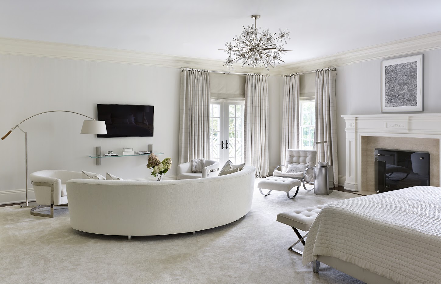
On the other hand, we might be looking for a serene and calm mood. This bedroom is a great example where we wanted to create a zen moment. We used lots of textures here, and the shapes of the lamps and curved sofa added to the softness, whilst bringing a sculptural element. There’s also a dramatic moment with the light fixture. The vintage Milo Baughman rocking chair and chairs bring further interest. Overall it’s harmonious, soft, inviting and restful, but still provides plenty for the eye to feast on.
Make Nature the Star
Sometimes the views outside the windows are the focal point, where we might still have a lush and luxe interior but the visual focus is looking through the room to the outside. In these rooms we might bring the outside in, using colors in harmony with the exterior. Textures again play a key role. Always avoid monotony with texture, wood tones, fabrics, and finishes.
Color in a Supporting Role
It may be that the color in the room is to play a supporting role, for example when there’s an art collection that you may want to take pride of place, or when the style or shape of the furnishings is the main focus. The furniture could be sculptural, or the shapes could be organic or antique, and a monochromatic color scheme allows the shapes to pop more. In these rooms the color is a visual punctuation for the artwork or the furniture.
A Favored Color
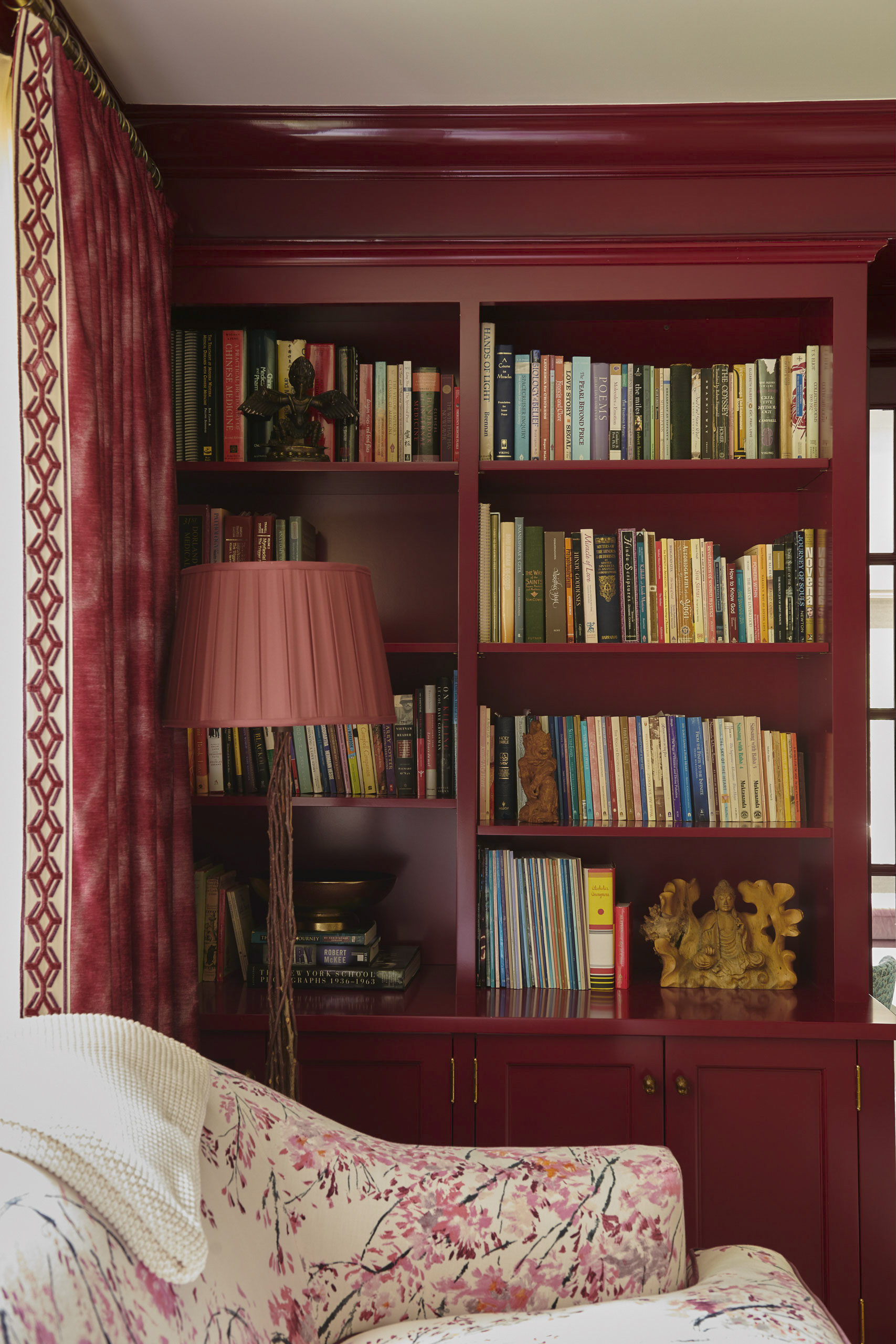
Sometimes the client has a color already in mind that they want to plan the room around. In the example below our client had a color vision for each space and each room, based on the spiritual meanings of the colors. The library was to be the “Rose Room”, based on the qualities of rose quartz bringing love into the home. We opted for a dramatic take on rose, keeping within the same colorway with the bookcases, sofa and drapes.
In all these examples, the reason and intention behind the choice of color plays a key role in determining the focus or the feel of the room. In these schemes textural variety, wood tones, and choice of materials is even more important than usual to ensure the room is successful.